Print & Collateral Design
Print creates connections that digital can't. A postcard that sits on a desk for months. An invitation someone saves in a drawer. These pieces were designed to make people pause, feel something, and hold on. Click any project below to see the full story.
In a world of endless digital noise, postcards and invitations cut through by arriving in someone's hands. That's an intimate moment — your brand in someone's physical space, on their desk, tucked into their bag.
For Magnificat Travel's gala and river cruise campaigns, the goal was warm, inviting, and unmistakably human. Design choices that honor roots in community and faith, and give people something they actually want to hold on to.


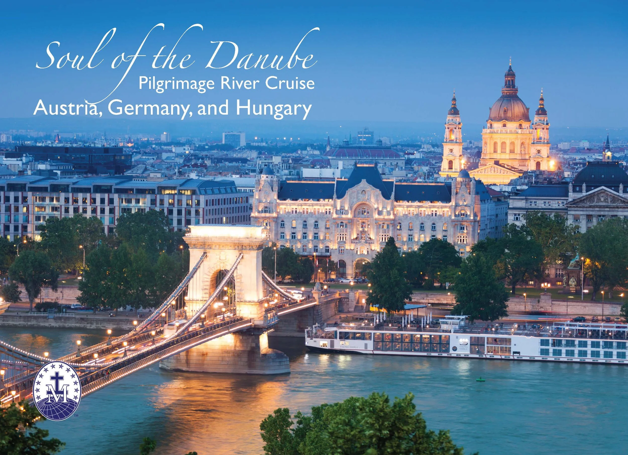
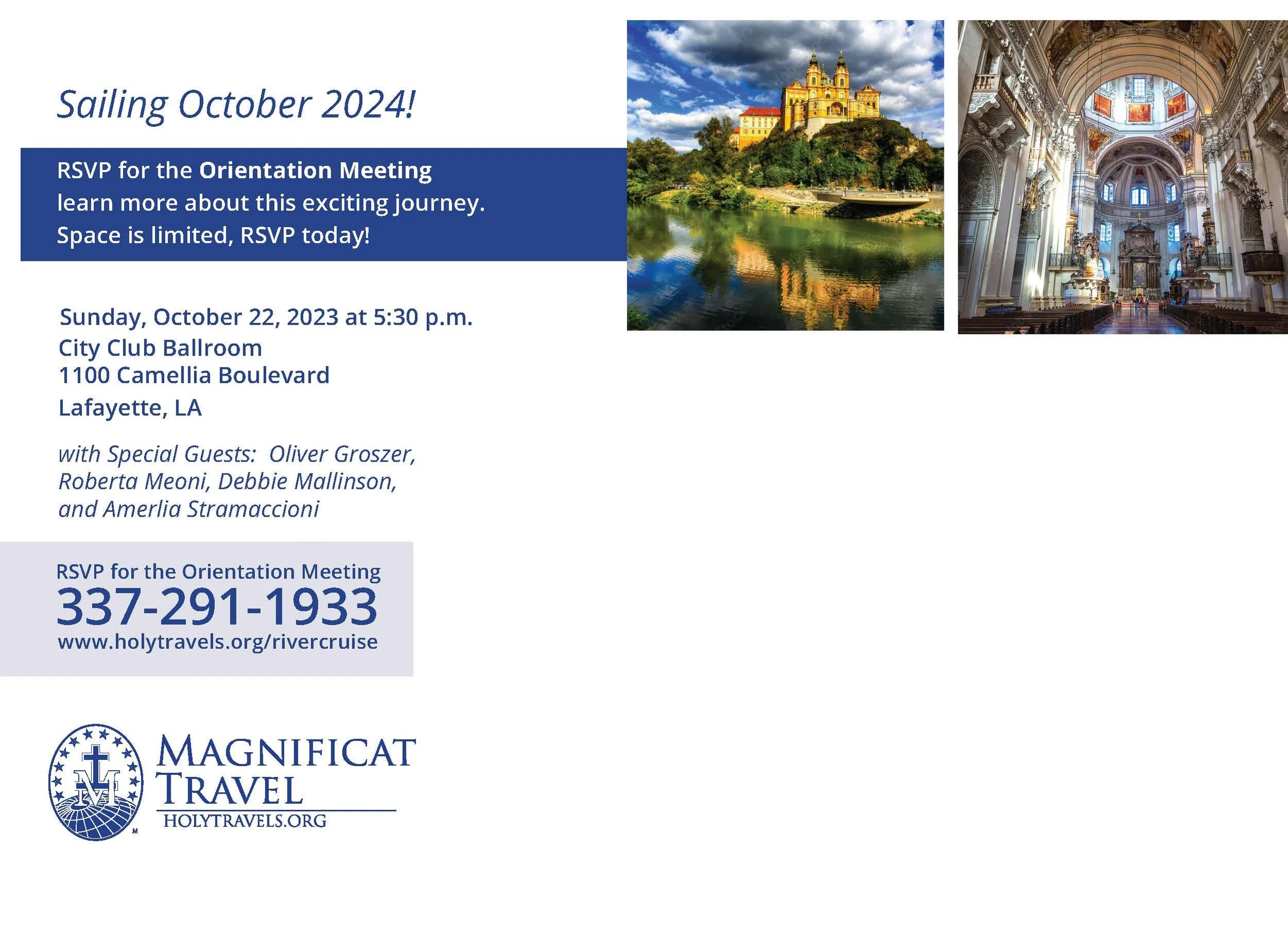
Work created for Magnificat Travel / Holy Travel
Once the postcards and tickets were building trust with Magnificat Travel, the relationship grew into something bigger: Magnificent Journeys, their biannual travel magazine, now in its 15th edition.
A magazine has to hold a lot of different jobs at once — a cover that reads as a destination photo essay, a table of contents that doubles as a teaser, pull-quote testimonials from travelers, reference-style grids for city-by-city itineraries, and a back page that closes the sale on the next trip.
Sixteen pages, twice a year, across photography-heavy spreads, data-style comparison grids, and typography built to carry a reader from cover to booking.
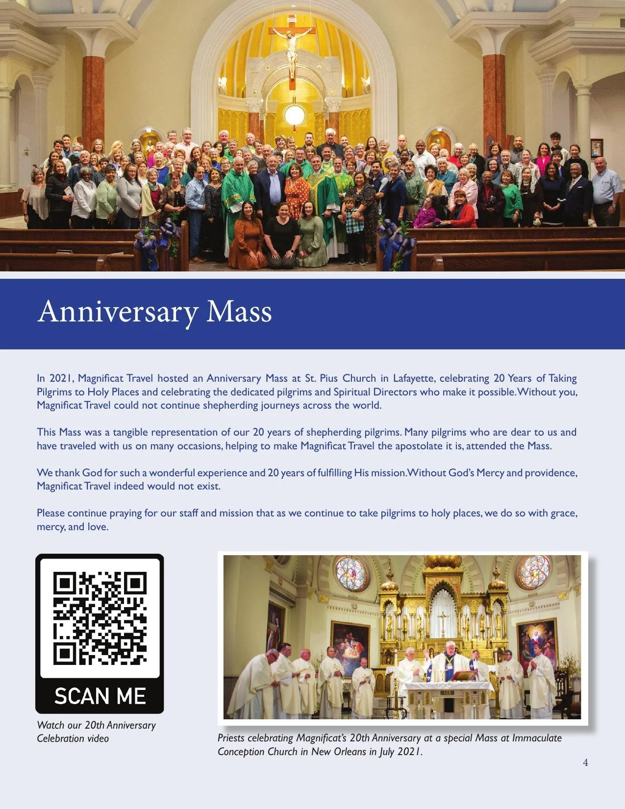
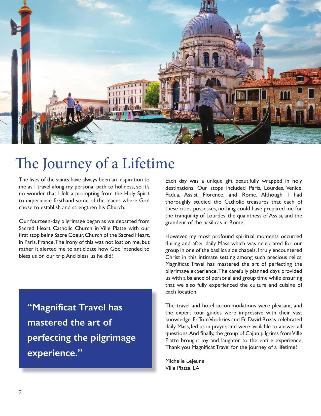
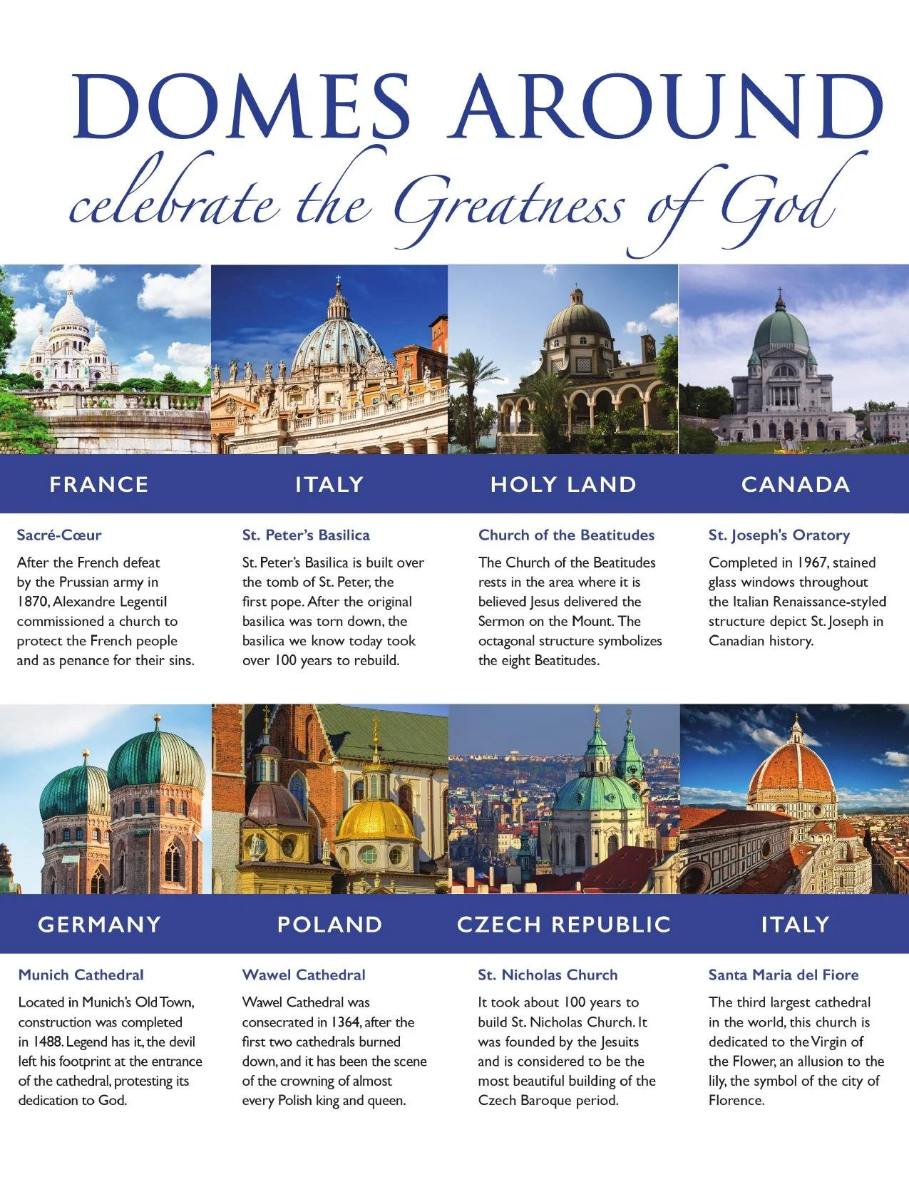
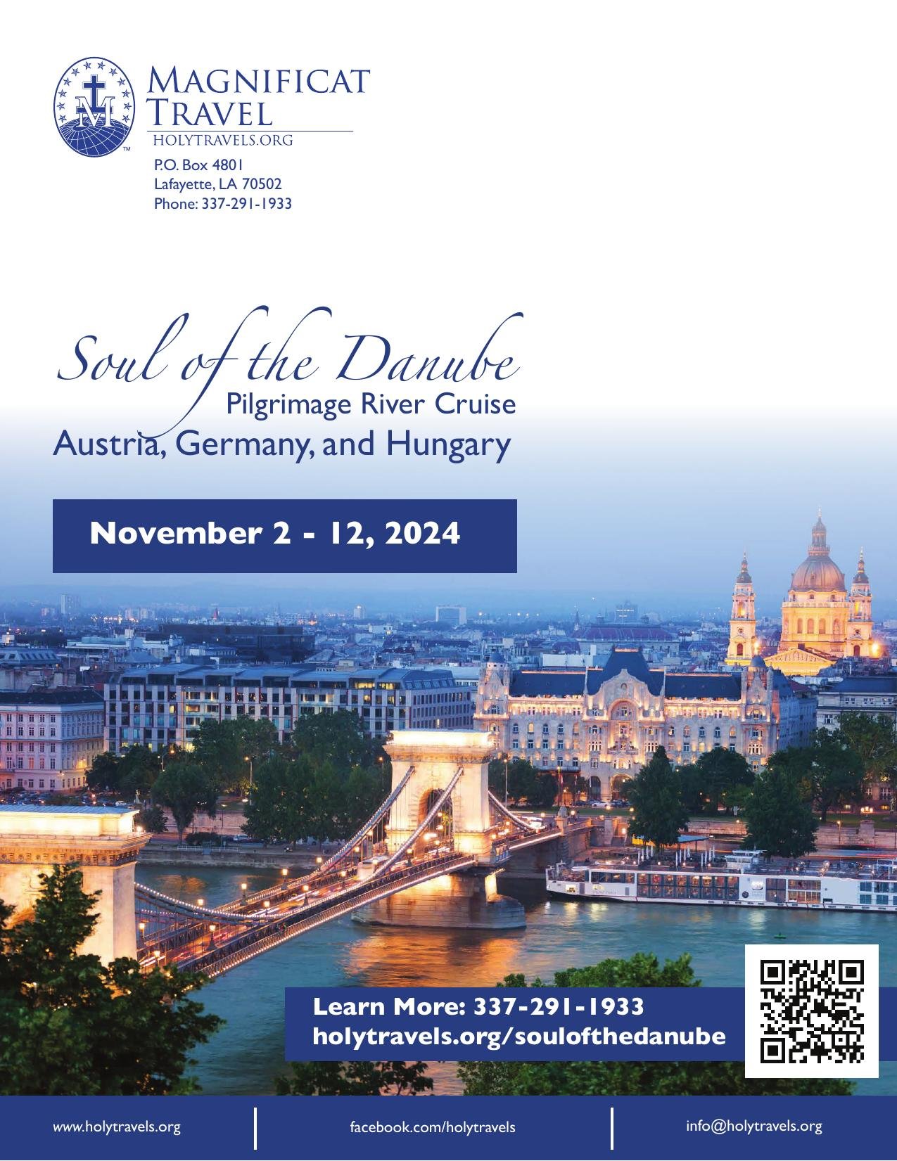
Work created for Magnificat Travel / Holy Travel
Historic preservation is relationship work. The built environment doesn't survive on goodwill alone — it survives because people show up, donate, and feel seen by the organizations they support.
The thank you card says: your support matters and we don't take it for granted. The sponsorship packet pairs that same warmth with a story worth investing in.
Flip the card. Page through the packet.
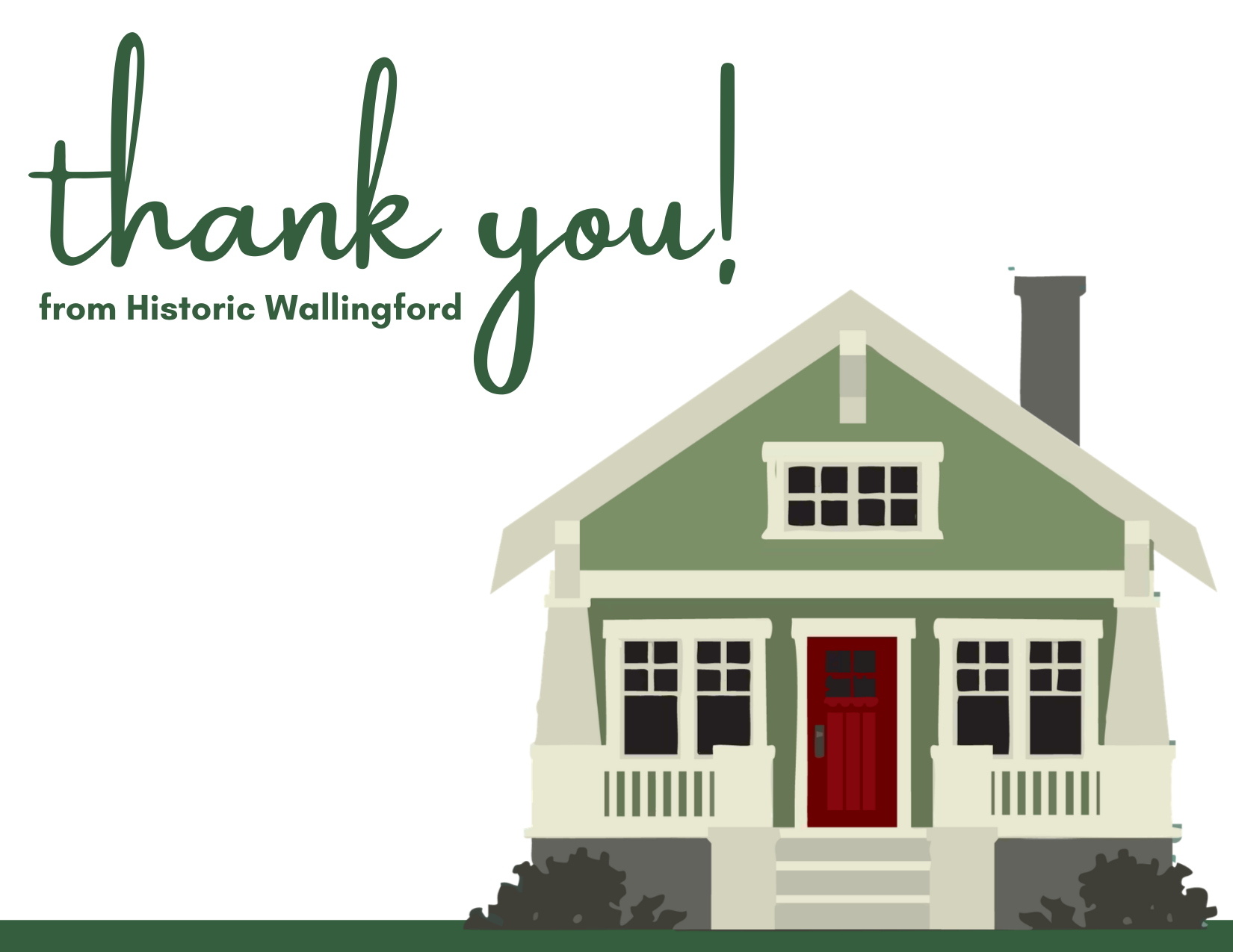
↻ click to flip
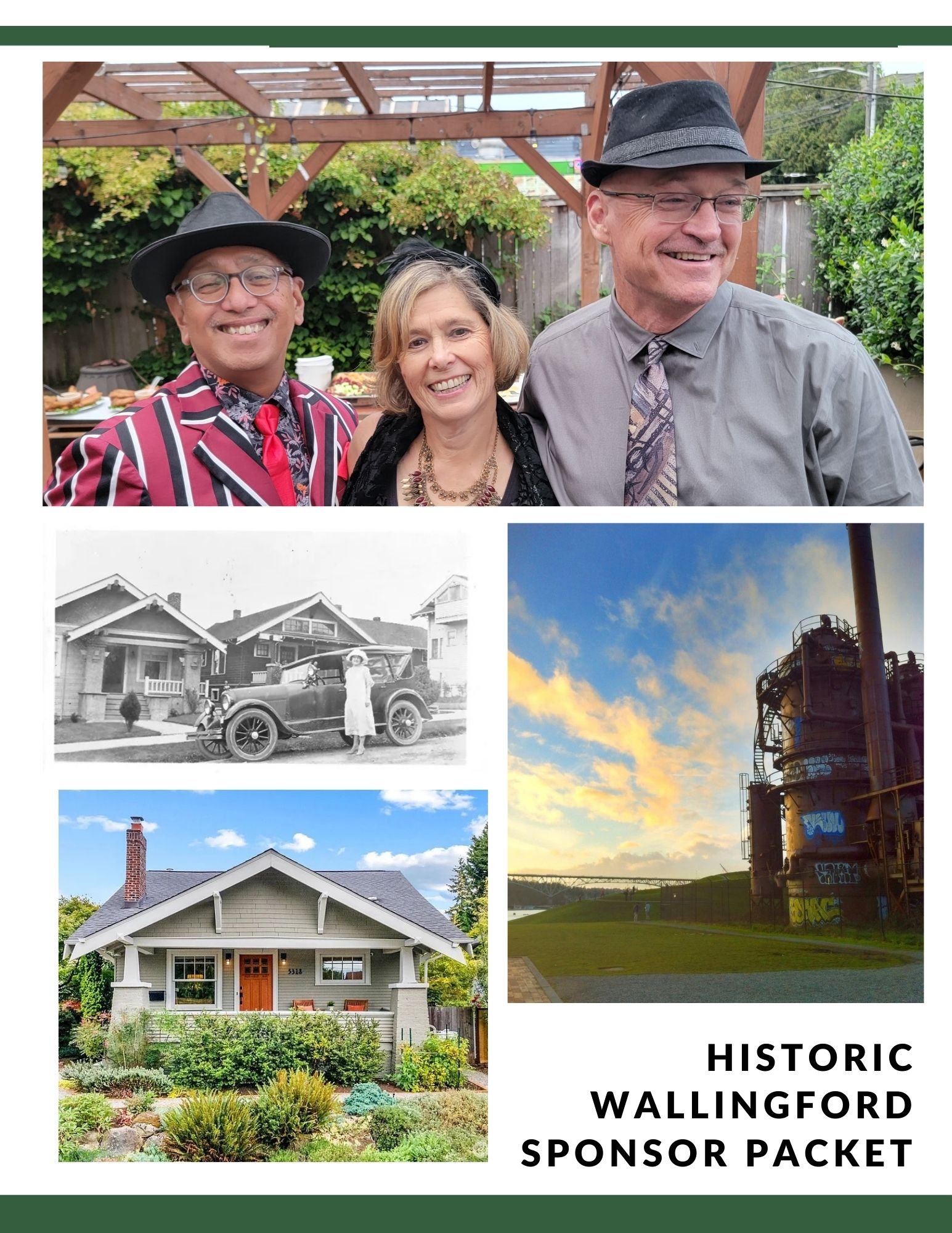
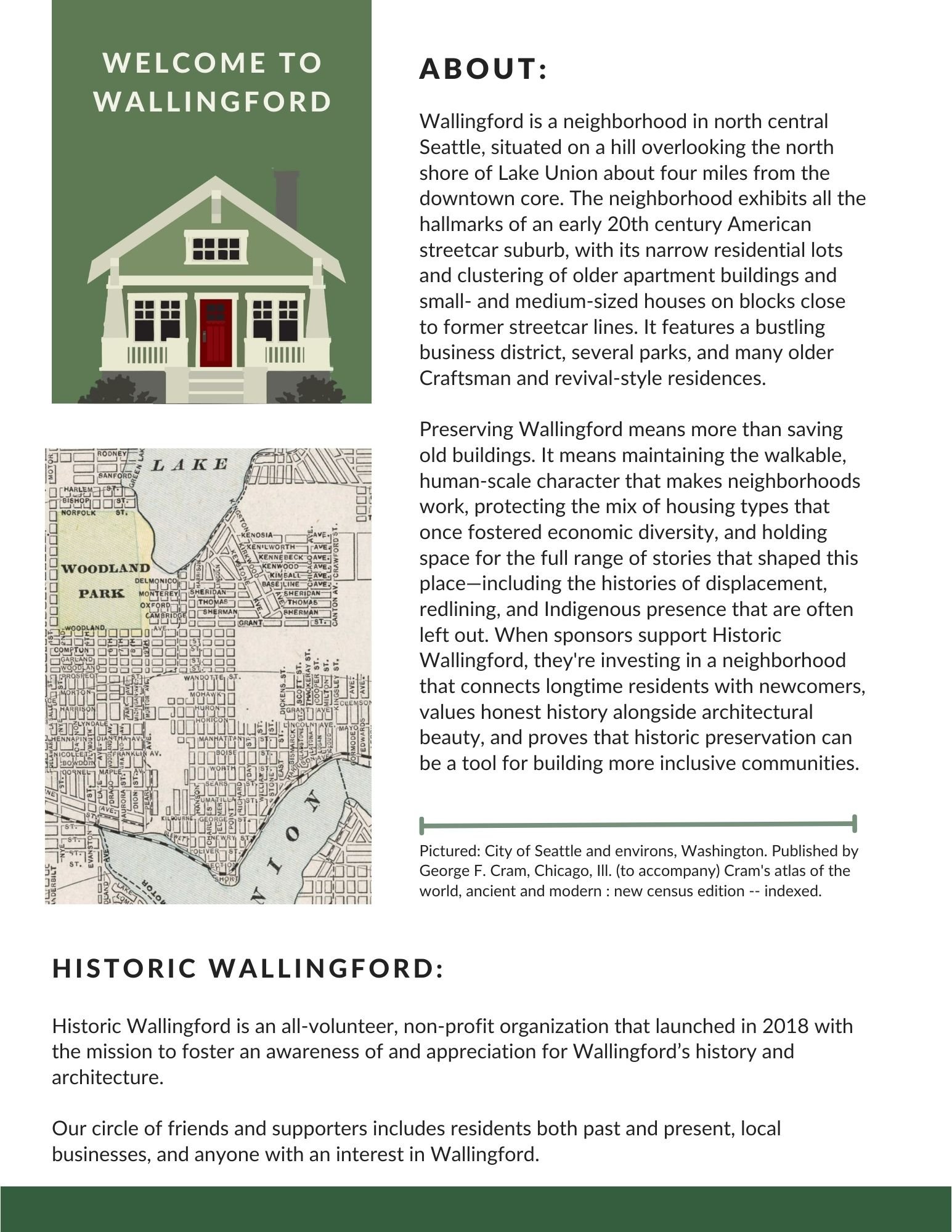
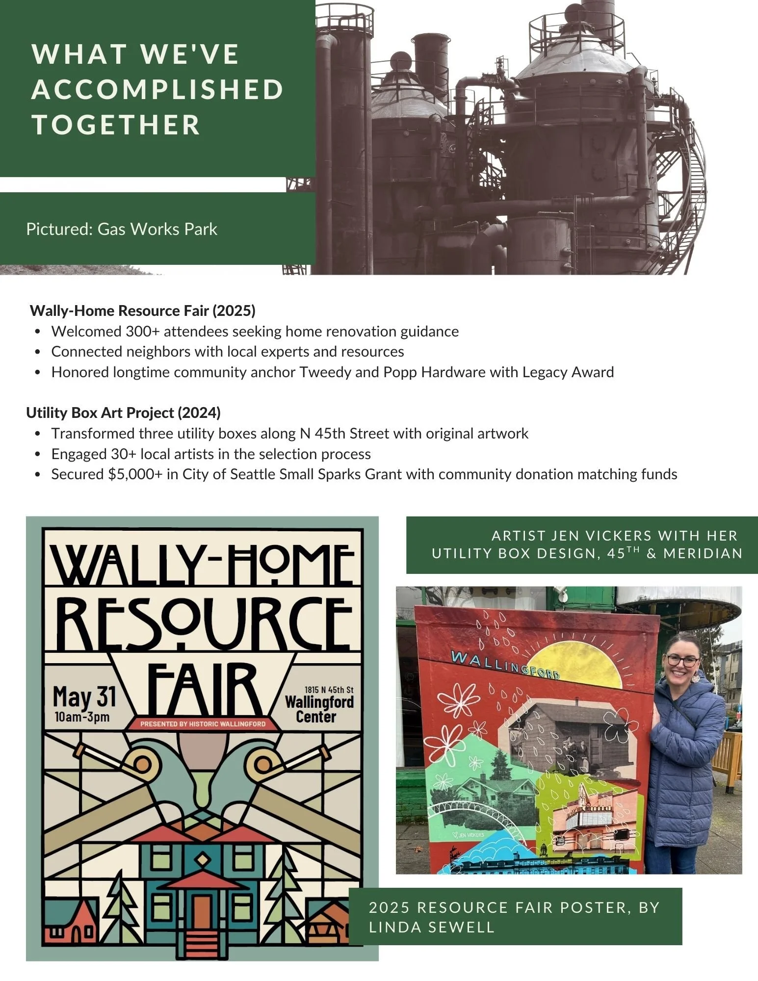
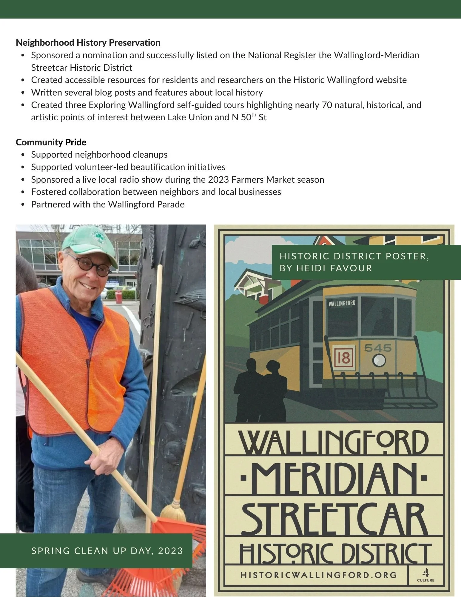
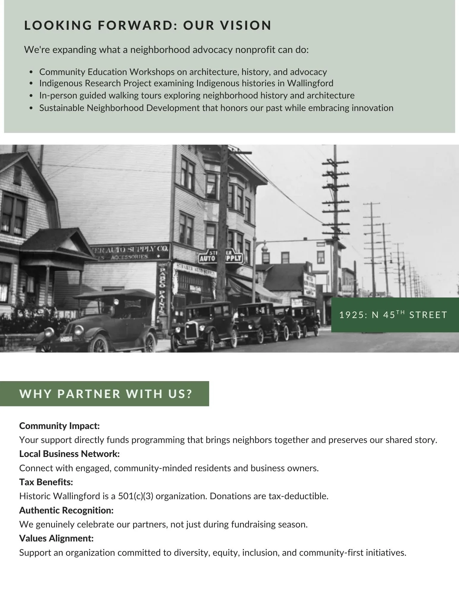
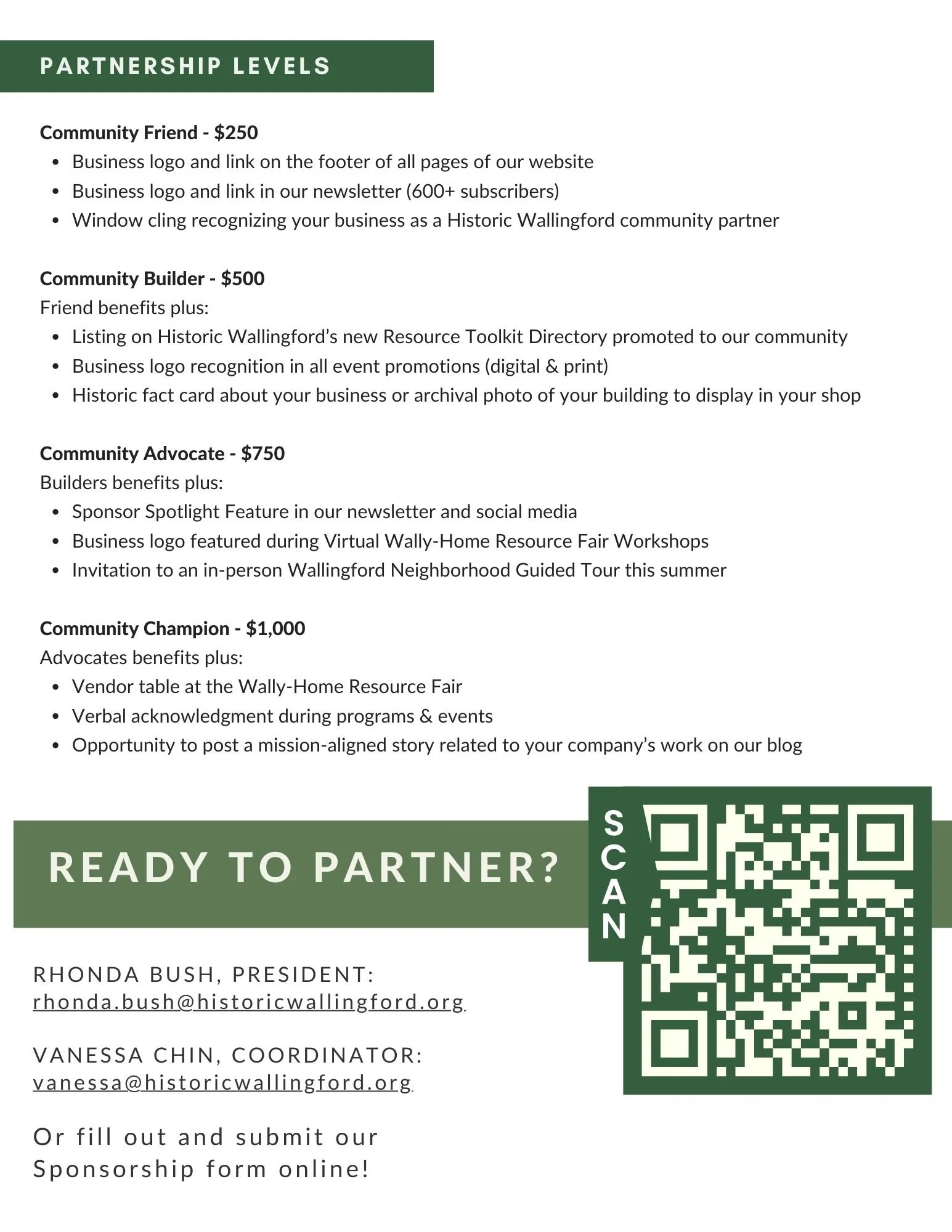
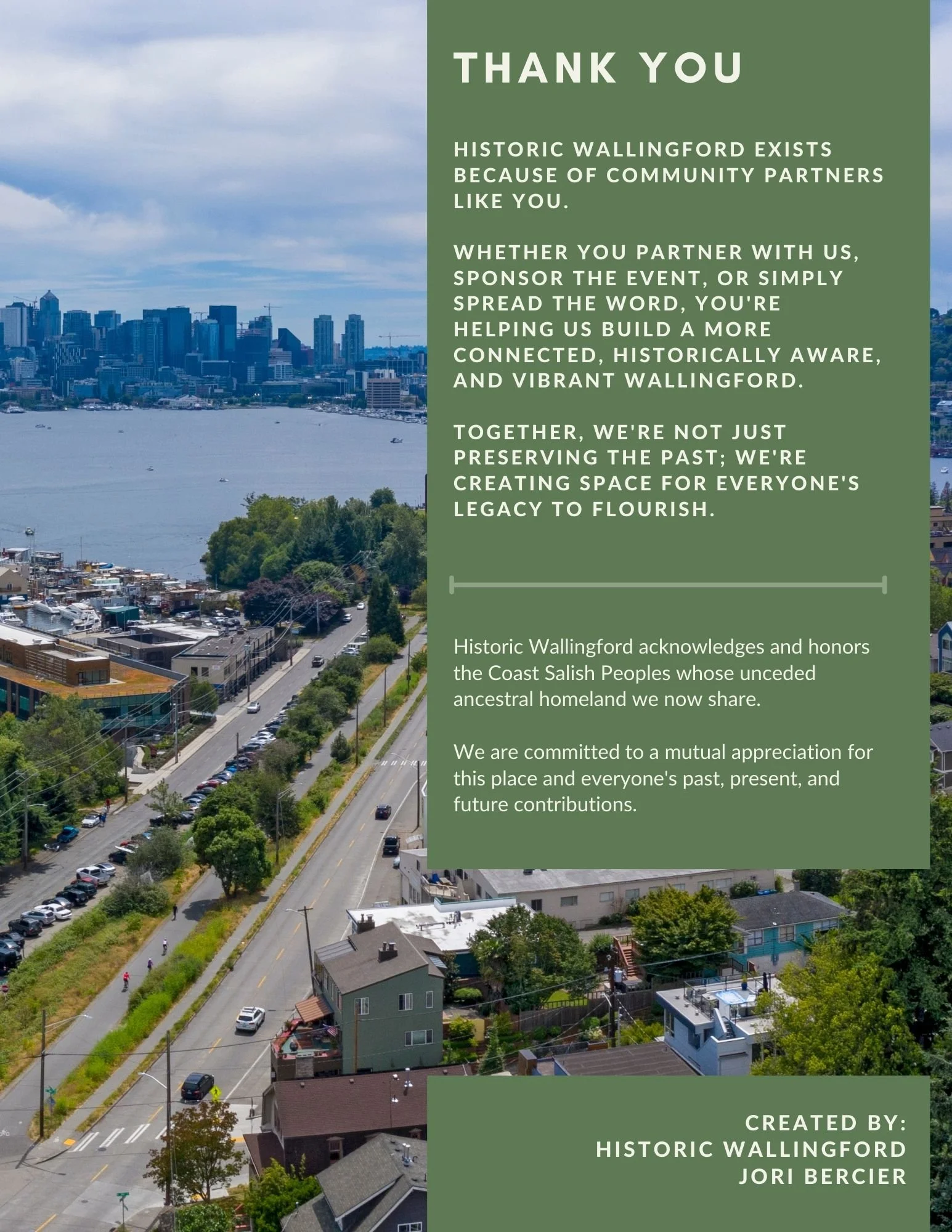
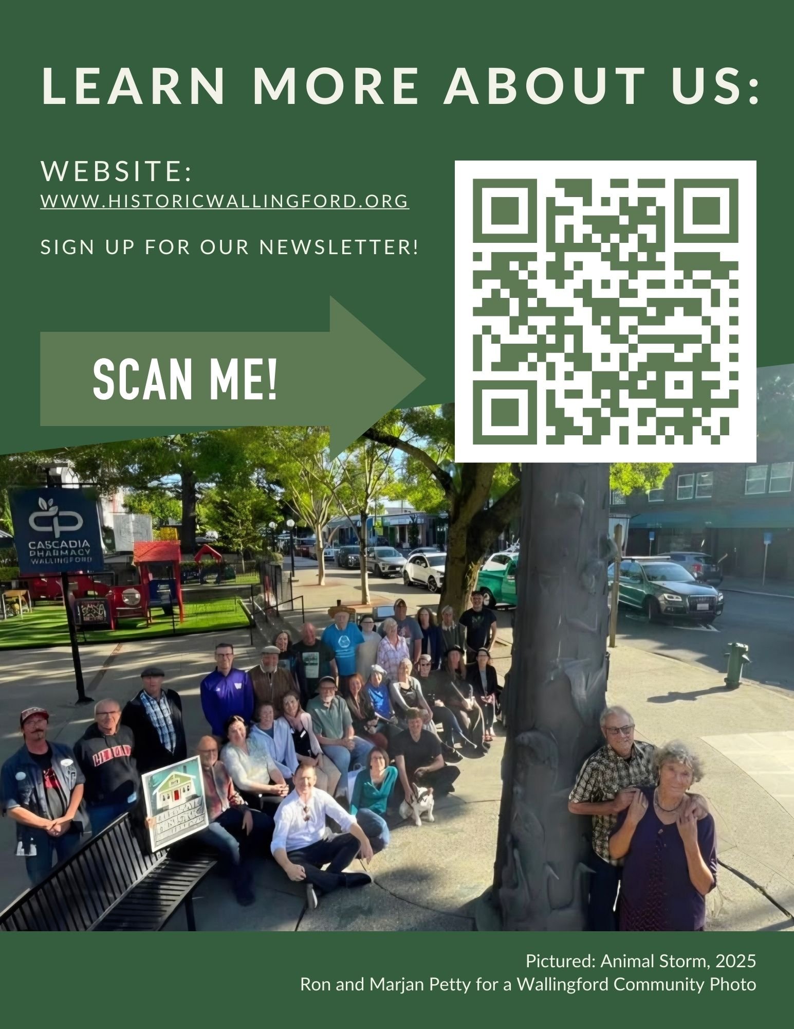
Work created for Historic Wallingford
Historic Wallingford's Indigenous Histories Research Project centers Duwamish and Coast Salish histories, voices, and futures in how the neighborhood's story gets told — moving past a one-line land acknowledgment toward sustained listening, research, and public scholarship.
The poster needed to hold a lot: an archival photograph doing most of the emotional work, a phased project timeline, and a clear call to action, all without overpowering the images or the history itself. The companion bookmark takes the same voice into a smaller, quieter format — a reading list someone can carry with them.
Design here meant restraint: letting archival photography from UW Digital Collections, MOHAI, and the Burke Museum lead, and building type and color around it rather than over it.
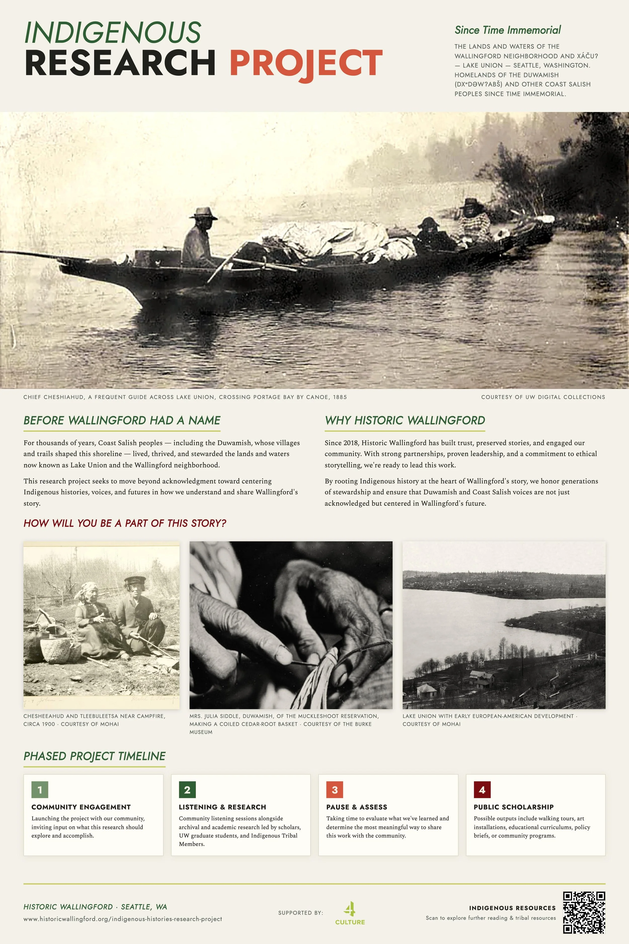
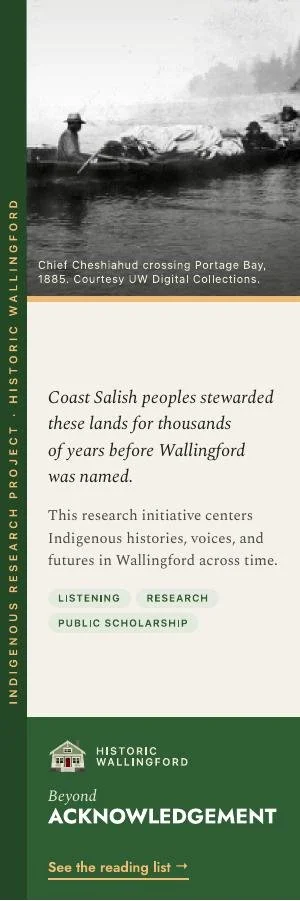
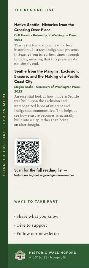
Work created for Historic Wallingford
A note on what follows: the next two projects are early work — parish and campus ministry communications, where I first learned to design for print. Those client relationships have since concluded, and their inclusion here reflects the craft, not an endorsement of any organization's positions. My portfolio spans multiple sectors, and quality of work has always come first.
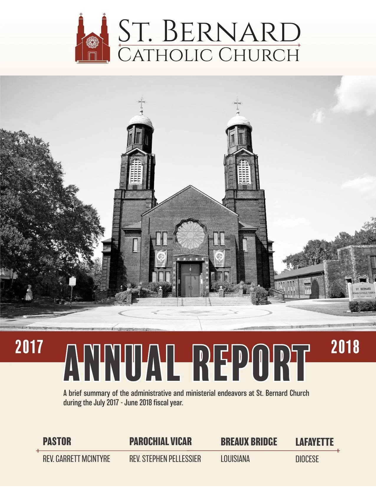
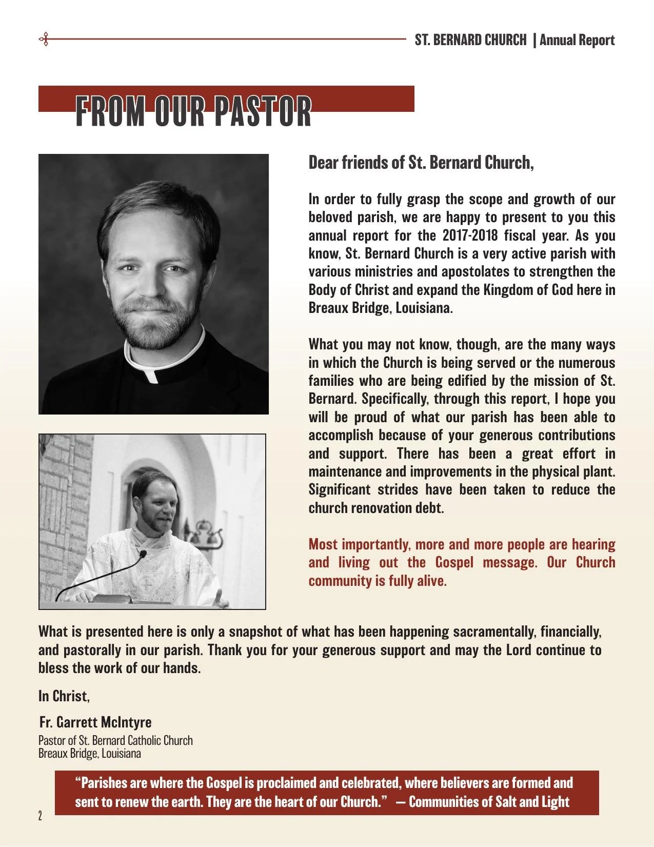
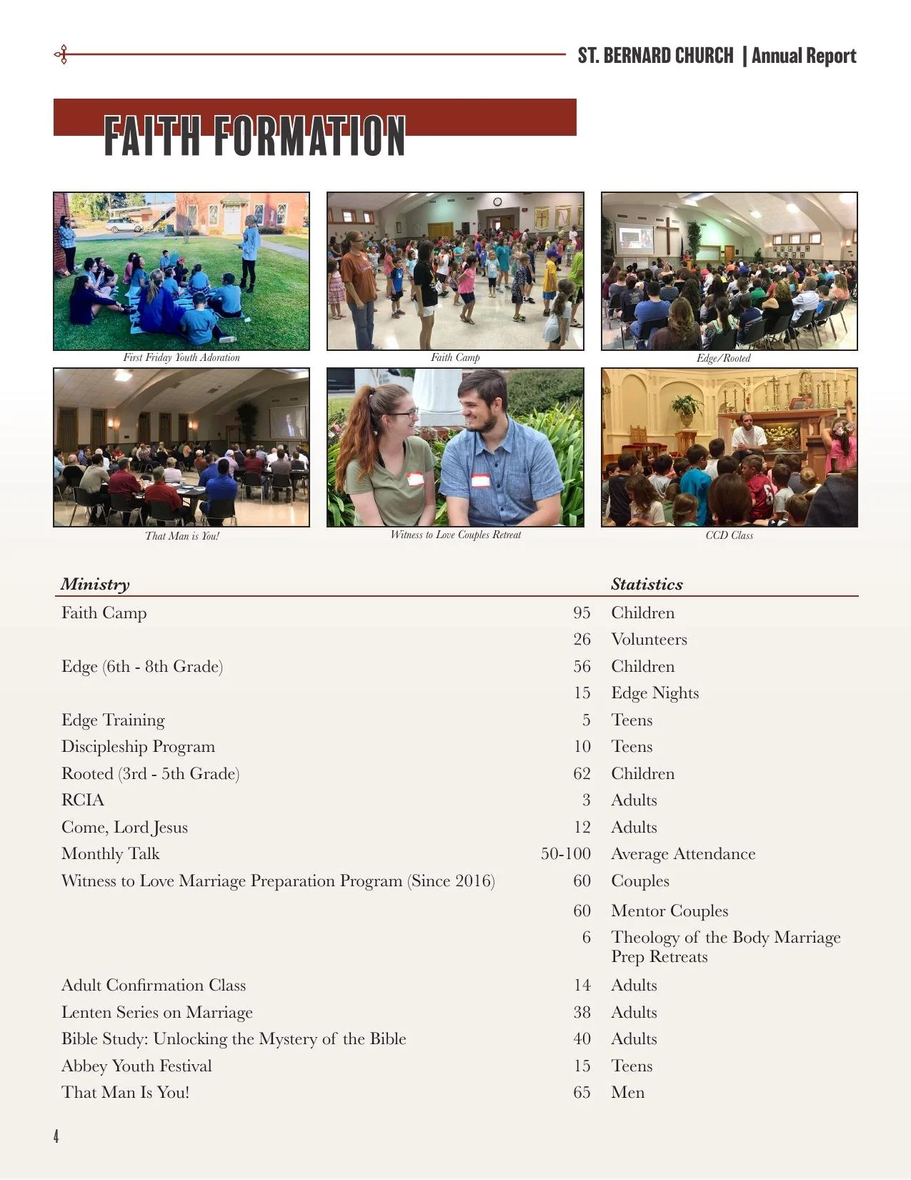
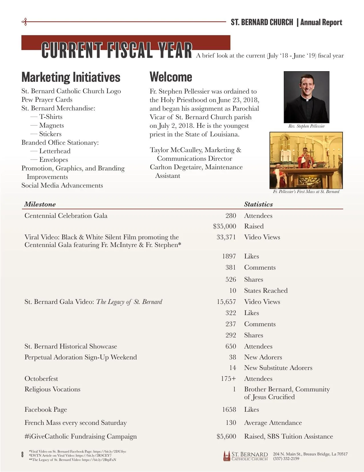
This was one of the first full identity systems I built end to end: a parish logo, letterhead and envelopes, pew prayer cards, and branded merchandise, alongside an annual report that had to do real work — communicating a fiscal year of ministry participation, facility upgrades, and financial stewardship to a community of donors and parishioners.
The report mixes data tables, staff photography, and pull quotes from parishioners, organized into sections that read more like a nonprofit impact report than a church bulletin.
It's early work, and it shows the fundamentals I still lean on: clear hierarchy, consistent brand marks, and design that gets out of the way of the content.
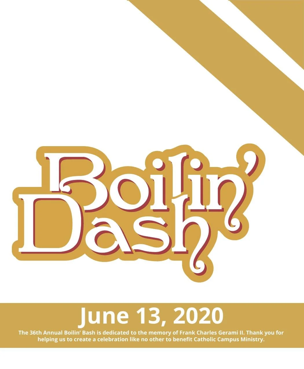
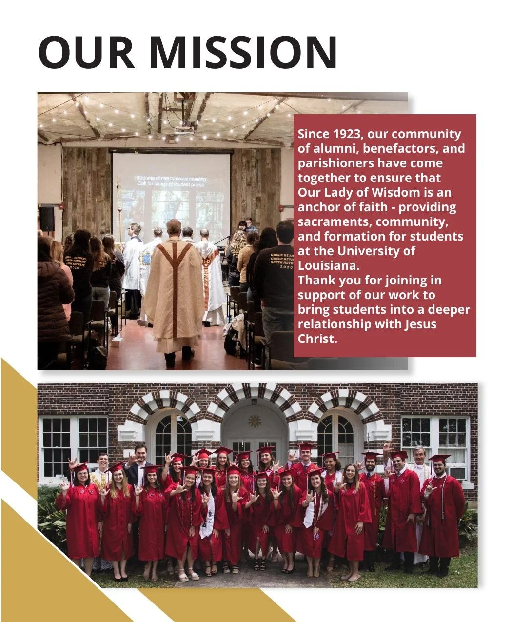
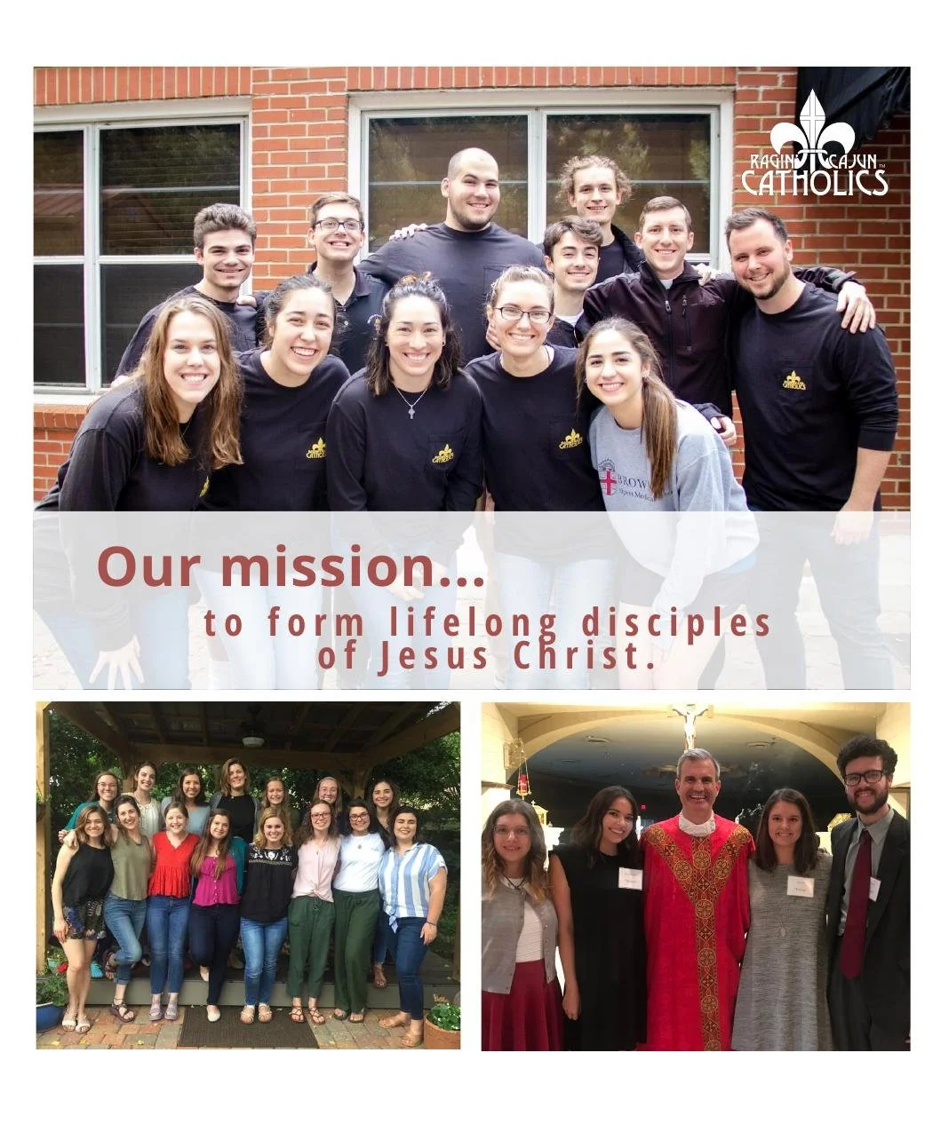
The 36th Annual Boilin' Bash — "Boilin' Dash" — is a crawfish-boil fundraiser for Our Lady of Wisdom Catholic Campus Ministry, benefiting student ministry at the University of Louisiana at Lafayette. That year's program was dedicated to the memory of Frank Charles Gerami II.
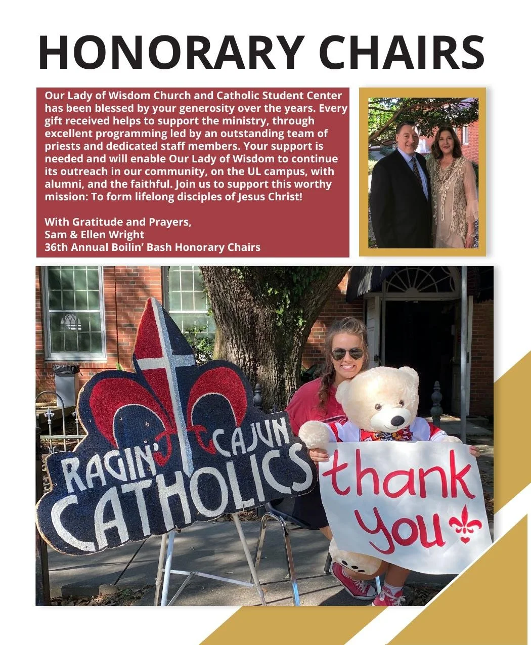
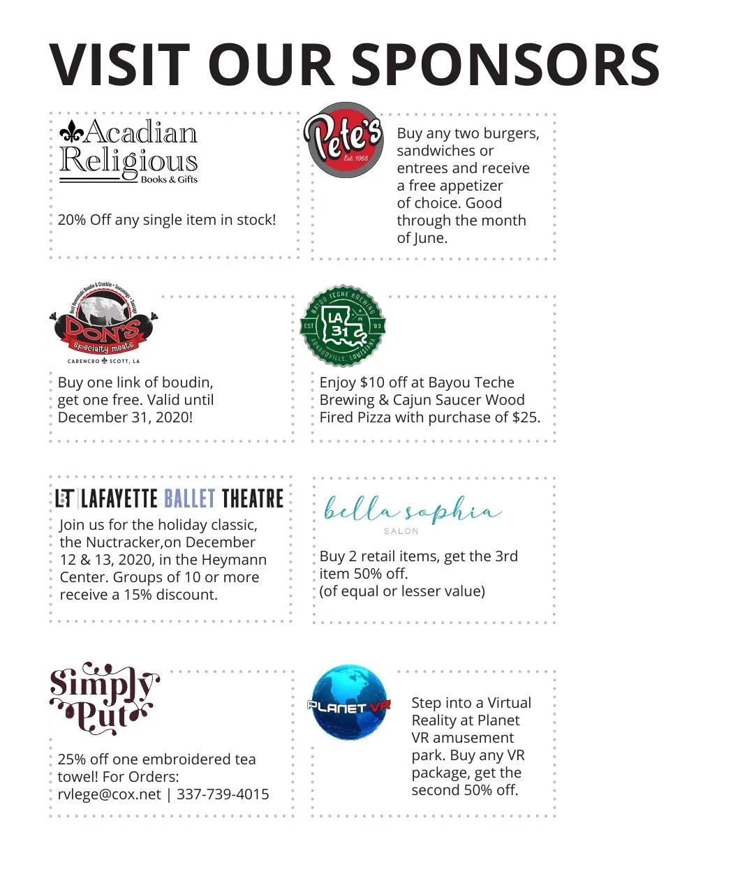
This meant designing a full print program from the ground up: a custom hand-lettered event logotype, tickets, an honorary chairs spread, and a tiered sponsor recognition system spanning a dozen-plus local businesses, all built to survive a chaotic outdoor event and still look sharp on a mantel afterward.
It's the kind of project that teaches you print production fast — tight deadlines, real printers, and sponsors who need their logo to look right.
Work created for Our Lady of Wisdom Catholic Campus Ministry / Ragin' Cajun Catholics
Ready to bring your brand into the physical world?
Print is personal. If you have an event, a campaign, or a story that deserves something tangible, let's talk.